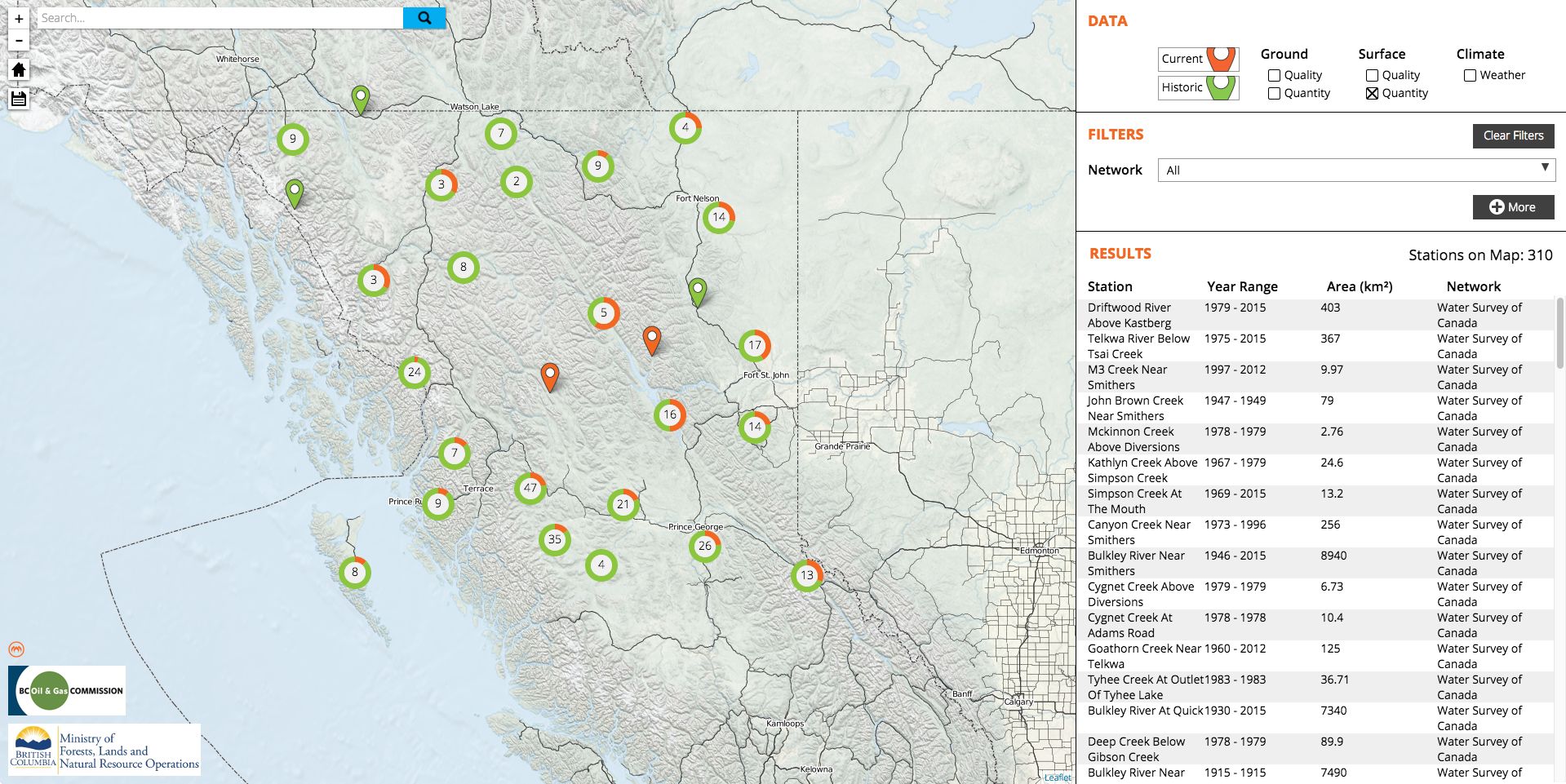
You can access the Water Portal on your computer through a current version of Chrome, Firefox, Internet Explorer, or Safari.
You can upgrade your browser Here or through the service of your choice.


Several infographics and tables are used to communicate information about the quantity and behaviour of water in rivers and streams. Data originates as daily measurements of flow, and are summarized in various methods as described below. The menu in the left hand pane lists content available for each hydrometric station, which varies by monitoring location type and based on data availability at each location.
This chart shows variations in flow based on historical measurements. For each year of data, a seven day average is calculated for each individual day. This is the average of the day in question, and the three days before and after. Using these seven day averages, percentiles are then calculated across years using the seven day averages for each individual year. The dark grey area shows the range between the 25th and 75th percentile. The orange line indicates the mean. The lighter grey areas delineate the 10th and 90th percentiles, and the minimum and maximum historical 7 day average flows recorded. On some stations, a blue line is overlain on the chart. These stations are connected via telemetry to the database and the blue line shows flow values for the current year. Caution must be used when considering current year values, as these measurements have very limited or no quality assessment.
This collection of charts uses daily flows to characterize flow by month, total volume of runoff by time period, and the flow characteristics within the selected time period using a flow duration curve. Menus at the top of the screen allow for selective display (filter) of data by year range, month or week. These parameters can also be set interactively on the Monthly Flow Statistics and Total Runoff charts, by clicking and dragging to define the time period of interest. When filters are applied, each chart updates dynamically to display the characteristics of only the data within the filter set. For example, by selecting an individual or set of years, the Monthly Flow Statistics and Flow Duration charts will only show data from that year range. When a week, month or range of months is selected, the Total Runoff and Flow Duration charts will only show data from that portion of the year, for all years available. When year and month/week filters are applied, data displayed again is only that contained within the filter criteria. Data presented in these charts been quality assessed by the data custodians and does not include current observations.
The streamflow characteristics presented are from the Inventory of Streamflow in the Skeena Region (Ahmed and Jackson, 2013). For additional information on methods please refer to the publication, available here: http://a100.gov.bc.ca/pub/acat/public/viewReport.do?reportId=40801
The monthly mean flow table summarizes daily mean streamflow values into monthly averages, for the entire period of record the station has been operating. Incomplete months are notated by ‘(n)’, and the table combines historical, quality assessed values with more recent unverified observations (years denoted by ‘*’)
Information on groundwater levels is displayed using a chart and table. Data originates as time series measurements of water levels below the ground surface, and is summarized as described below. The menu in the left hand pane lists content available for each observation well.
The groundwater hydrograph displays historic monthly groundwater levels, and, where available, current year groundwater levels. Data is displayed as depth to water below ground surface. The orange line displays mean groundwater level by month. The dark grey shows the range between the 25th and 75th percentile, and lighter grey the range between minimum and maximum values. Where current year data is available, it is displayed as a yellow line. Historical values include only quality assessed data, whereas current year data may be subject to substantial error.
The monthly mean levels table summarizes groundwater level values into monthly averages, for the entire period of record the station has been operating. Incomplete months are notated by ‘(n)’, and the table combines historical, quality assessed values with more recent unverified observations (years denoted by ‘*’). In many cases, where observation wells have been operating for a significant time, historical data is only available at monthly time increments.
All available water quality observations are provided as they occur in the originating database, including parameter name and value. Data may be saved where license permits.
Daily weather time series data collected from sensors have been processed to provide information on seasonal climate characteristics. These characteristics are shown in a range of charts, each of which are described below.
Daily maximum and minimum temperatures are presented on the temperature chart. The dark grey band represents the range between the average daily maximum and average daily minimum temperature for each day. The lighter grey background represents the range between the 10th percentile of minimum temperature, and 90th percentile of maximum temperature. For stations with current observations of temperature, daily maximums are presented with a red line, and daily minimums with a blue line.
The precipitation chart presents historical variations in monthly precipitation on a monthly basis. The candlestick plot uses an orange line to represent monthly median precipitation. The wider grey box shows the range between the 25th and 75th percentile, and the narrower grey line extends between the 10th and 90th percentile. For stations which are currently observing precipitation via telemetry, observations from the past 12 months are presented using blue, and show daily and cumulative precipitation over the course of the month.
The Snow on Ground – SWE chart shows snow accumulation, measured as millimetres of snow water equivalent. This chart represents the mass of water present as opposed to a snow depth which may be of varying density. The dark grey represents the range between the 25th and 75th percentile of historical observations, with the lighter grey extending between the 10th and 90th percentiles. Current year observations, where available, are displayed using a green line.
The Snow on Ground – Snow Depth chart shows snow depth, measured in centimetres. This chart shows the depth of snow observed at any given day. The dark grey represents the range between the 25th and 75th percentile of historical observations, with the lighter grey extending between the 10th and 90th percentiles. Current year observations, where available, are displayed using a green line.
The Snow Water Equiv (manual snow) chart is only visible for manual snow survey stations. This chart shows observed snow water equivalent values (in mm) for regularly occurring snow sampling programs. These programs visit a location up to 8 times per year, and are timed to fall within +/- 5 days of the target date each year. The boxes extend from the 25th to 75th percentile, with median (50th percentile) snow water equivalent shown as a line across the box. The whiskers extend to the 10th and 90th probability of snow water equivalent.

The Water Portal presents data from a variety of sources related to water resource management. Some of the data presented here have undergone a formal review and assessment process by the custodian prior to publishing, but others have not. Current year stream discharge values in particular should be considered as provisional.
Wherever possible, the custodian responsible for collecting and managing the data has been identified, and this custodian is the primary contact for any questions regarding the accuracy, QA methods, or any other issue related to data quality.
It is the responsibility of all persons who use the Water Portal to independently confirm the accuracy of the data, information, or results obtained through the use of of the Water Portal, should it be necessary for the user's purpose. Users requiring access to raw data for their own analysis should acquire such data from the relevant data custodian, to ensure that any revisions or changes made by the custodian are reflected in the data, and that any provisions, caveats, or notes accompanying the raw data can be provided for consideration.
The BC Energy Regulator (BCER) does not warrant the quality, accuracy, or completeness of any information, data or product from these web pages, and accepts no liability or blame for loss or damages incurred by any person or business entity based on the use of the Water Portal. It is provided 'AS IS' without warranty or condition of any nature. No guarantee of any kind is expressed or implied.
Proceeding beyond this Disclaimer will constitute your acceptance of the terms and conditions outlined above.
Decline Accept